Case 04 · Oak & Ember
A checkout with nothing left to remove
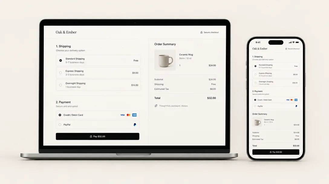
Replaced a five-step checkout with a single calm page for an independent homeware store.
- Role
- Design engineer
- Year
- 2024
- Duration
- 10 weeks
- Client
- Oak & Ember
- Stack
- RemixShopify HydrogenStripeMotion
01 — Problem
Oak & Ember sells handmade stoneware. 71% of mobile carts were abandoned, most of them at the address step, which asked for the same postcode twice.
02 — Process
- 01
Count the decisions
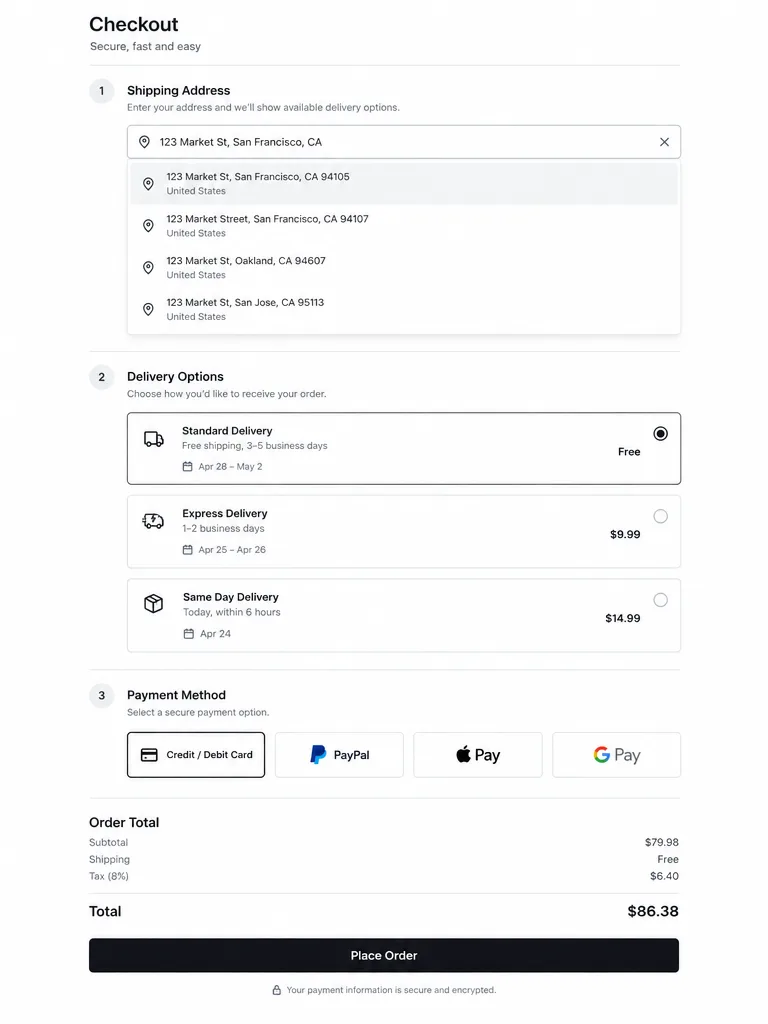
We listed every decision the old flow asked for — there were 19. The new page asks for 6, and fills the rest from the address and the basket.
- 02
Motion that explains
Delivery options slide in only after an address resolves, so the page grows in the order you think. Every transition is under 240 ms and switches off with reduced motion.
- 03
Measure in production
We shipped behind a 50/50 split for three weeks and watched field-level drop-off rather than page views.
03 — Result
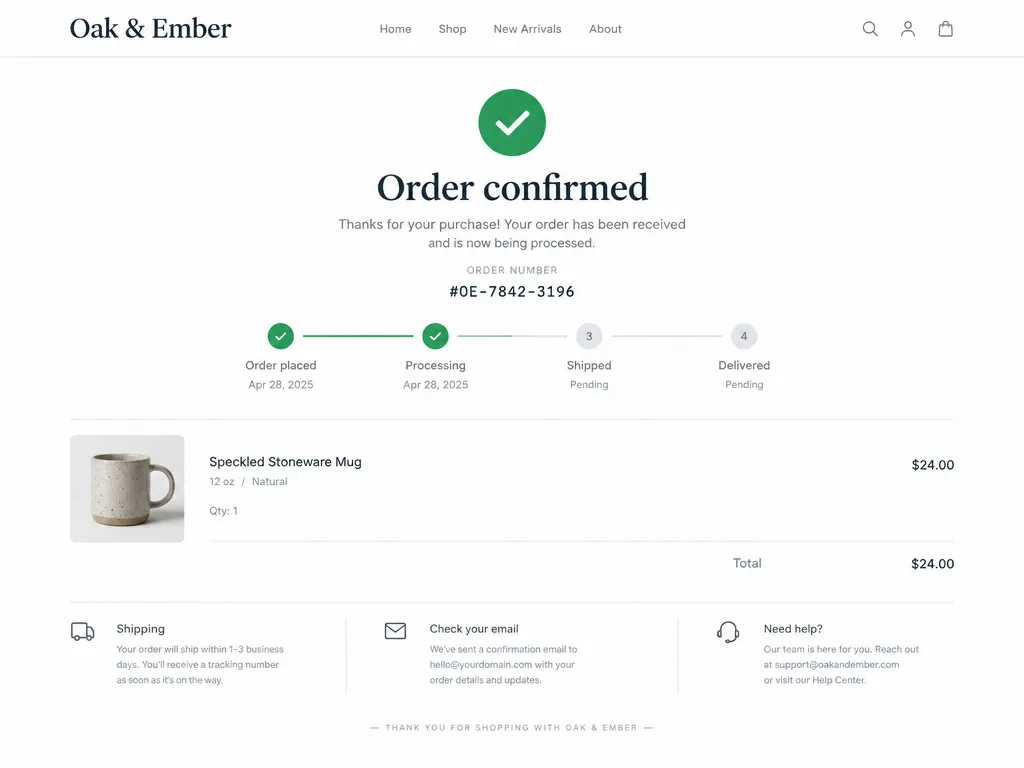
Mobile conversion rose by a third and the confirmation page now links straight into live shipping status.
- mobile conversion
- +34%
- decisions to pay
- 19→6
- median time to order
- 58s
Next case
Ledgerline
A finance dashboard owners open on purpose
Read case→