Case 01 · Ledgerline Inc.
A finance dashboard owners open on purpose
Rebuilt the core web app for a bookkeeping startup: invoices, cash flow and a forecast people actually trust.
- Role
- Lead design engineer
- Year
- 2026
- Duration
- 5 months
- Client
- Ledgerline Inc.
- Stack
- Next.jsTypeScriptRadixVisxFigma
01 — Problem
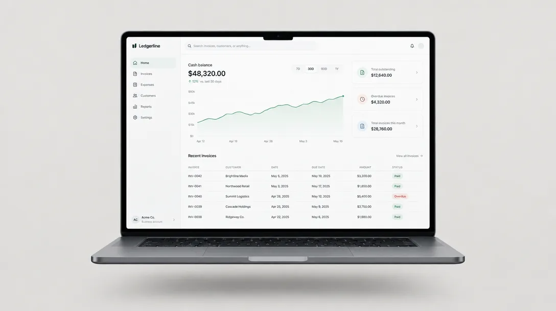
Ledgerline had 14,000 small-business accounts and a dashboard most of them opened once a month, usually to export a CSV and leave. Support tickets told the same story: people could not tell what they were owed, what they owed, and what next month would look like.
The product had grown three navigation systems, two table components and no shared definition of what “due” meant.
02 — Process
- 01
One question per screen
We rewrote the information architecture around three questions: who owes me, what do I owe, what happens next. Every screen that didn’t answer one of them was merged or deleted — 23 routes became 9.
- 02
Prototype in the real stack
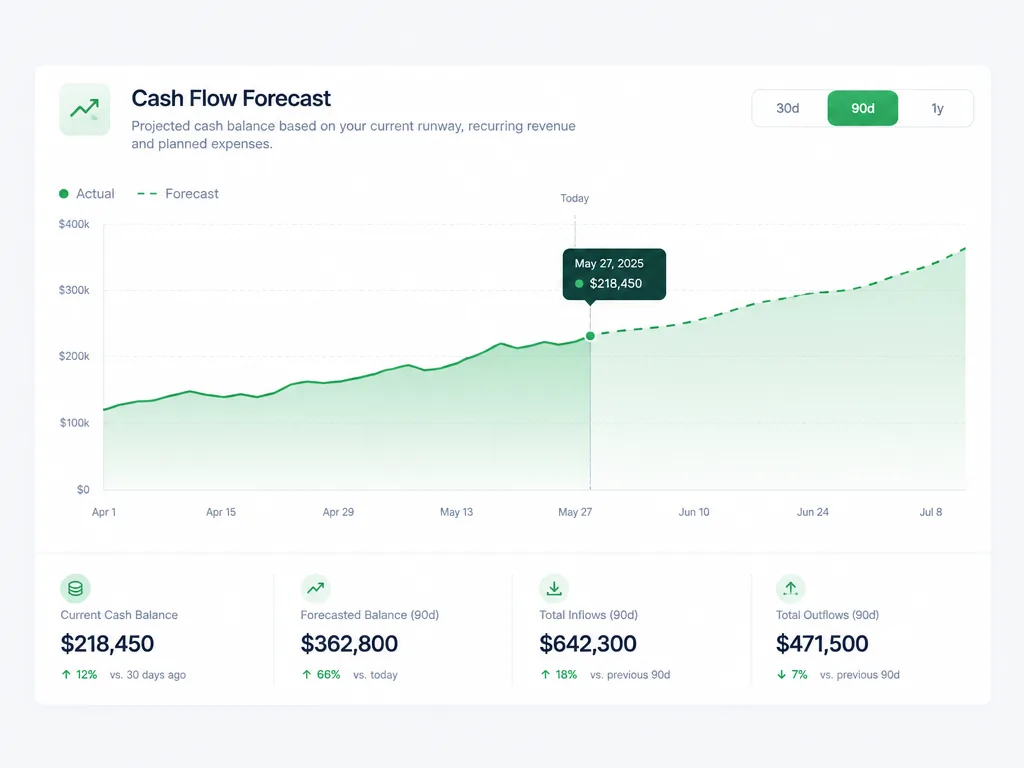
Instead of static mocks I built the forecast chart in code from week two, wired to anonymised production data. Owners reacted to their own numbers, which surfaced edge cases no Figma file would have: negative weeks, currency mixes, invoices paid in thirds.
- 03
A table that earns its density
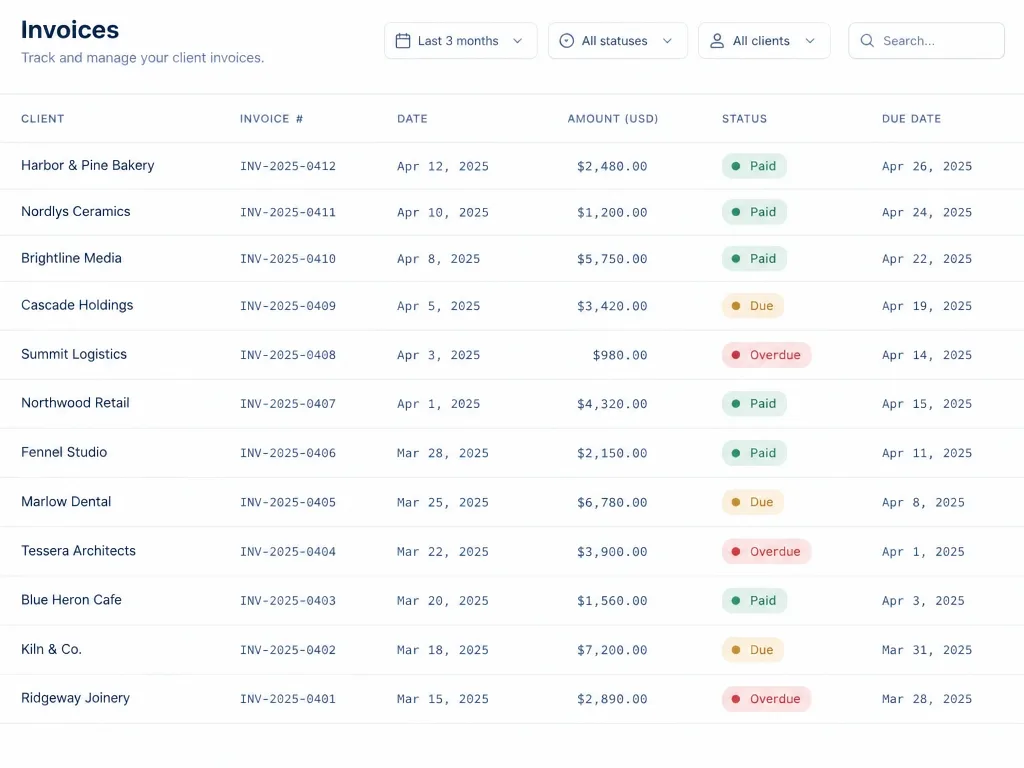
The invoices table got keyboard navigation, sticky totals and inline status edits. Monospaced tabular figures made columns scannable at a glance without adding a single line of chrome.
- 04
System, then screens
Tokens, 31 components and their motion rules shipped as a package before the redesign went live, so the team could keep building after I left.
03 — Result
The new dashboard rolled out to all accounts in March. Weekly active use tripled within six weeks, and the forecast became the most-opened view in the product.
- weekly active owners
- 3.1×
- “where is my money” tickets
- −42%
- top-level routes
- 23→9
Next case
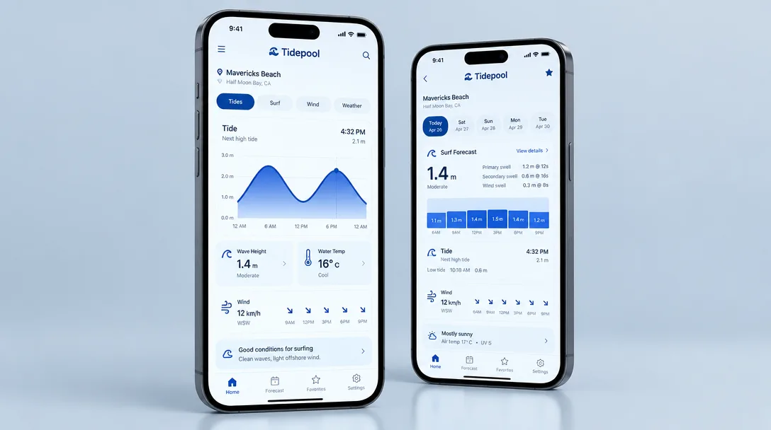
Tidepool
Reading the ocean in one glance
Read case→